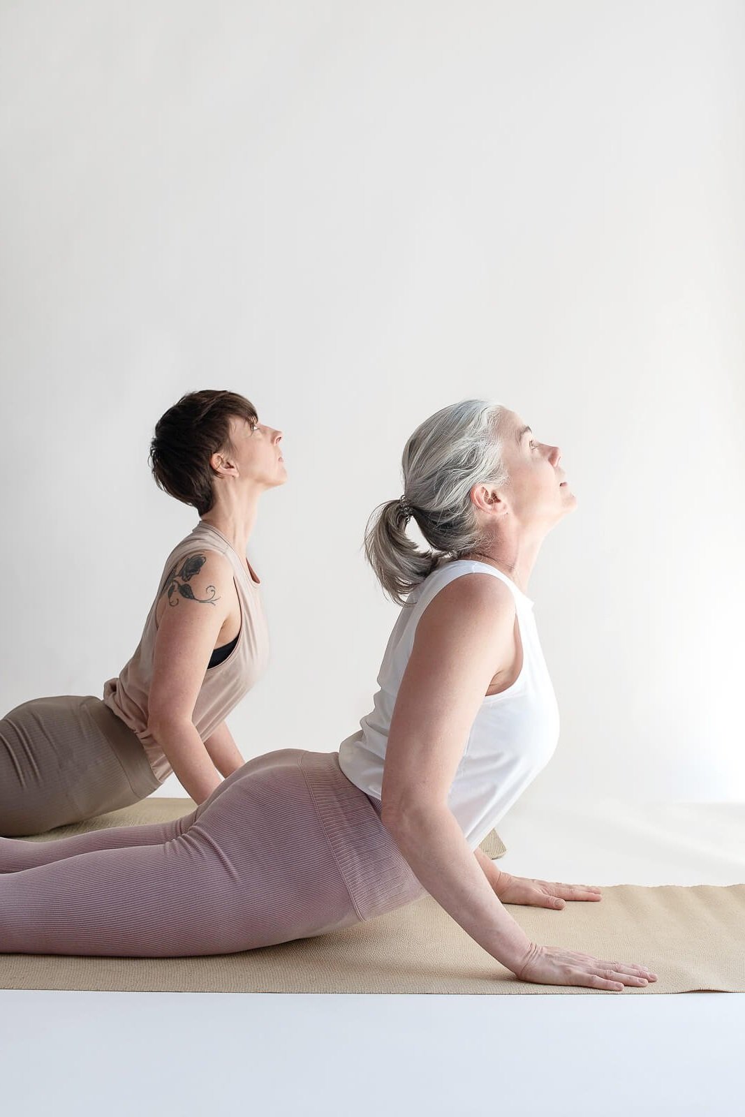
Tired of the same old, same old? Me, too.

myoga is an intimate, boutique yoga studio in Fremantle, Australia focused on individual attention & hands-on instruction.
Project details: branding, photoshoot strategy, SEO strategy and Custom 8-page website
Timeline: 6 weeks
Platform: Squarespace 7.1
Lines of code: 1,400+
project goals
Kellie Brett has been on her yoga journey for 30 years, and has over a decade experience of teaching Iyengar yoga. She moved her yoga studio from her home to an official commercial space 6 months before reaching out to me, and wanted a website for her studio.
Interestingly enough she found me while looking for a business coach and wondering if that’s the direction she needed to go in (SEO works, y’all!). After we had a conversation about her business and her needs, she decided to invest in a new brand and custom website.
Yoga Studio Branding
Kellie didn’t have branding that lit her up, even though she had an existing website, so we started there.
I had a very clear vision from the beginning of a high-end, California casual meets welcoming and inclusive space, while also keeping it calm and minimal.
Then we created her logo, which is a capital M for myoga, but also represents the yoga teacher laying their hands on and gently adjusting the student doing a yoga pose. This is the differentiating factor for myoga versus other larger yoga studios that don’t offer Iyengar yoga or this methodical approach that I zeroed in on right away, and wanted to pull into the visual brand identity.
From there I did something I’ve never done before, and I created a custom seamless pattern for myoga with the vision that it would be used on yoga merchandise that Kellie could sell to generate extra revenue, such as tote bags, apparel, or water bottles.
I created a series of simplified, minimal icons that represented a number of individual yoga poses, and then turned that into the seamless pattern. I mocked up a few items to show Kellie how the pattern, and she absolutely loved it. I used this custom pattern on the website as a placeholder to separate other sections.
I’m in love with the graphic black and white bag with the yoga pose pattern, and when Kellie orders her merchandise, she already promised she’d send me one (you better, Kellie!).
PHOTOSHOOT STRATEGY
I’ve started including photoshoot strategy in my custom projects to help my clients get the most useful photos to use on their website and in their business going forward. Photoshoots can be expensive, and there’s nothing worse than a collection of beautiful photos that aren’t quite lining up with your brand strategy and overall feel.
The myoga website was initially mocked up (formally called wireframes) with stock photos, and while Kellie had some great photos from a previous shoot, they weren’t fitting in well with the new brand direction.
She set up a new photoshoot after we had completed her new branding, and so we had a very clear idea of what we would need to complete the website.
I completed an in-depth photoshoot strategy document and video explanation to share with the photographer, including:
3 different sets of recommended photos styles, including examples and explanations
apparel and prop recommendations (for colour and style)
inspiration photos to provide a visual representation of the feel that we wanted in the photos
We ended up with photos that were perfect for the look, feel, and need of the new website.
Here’s a sneak peek at the photoshoot strategy document that Kellie received:

Yoga Studio website
After completing the branding, it was time to move onto the website. Kellie had a very clear vision of a website with only 3 options on the navigation bar and a simple footer, but other than that she didn’t have any specific features that she wanted or needed.
I recommended she use a more robust online booking system to complete the clear flow from new website visitor to paying customer, and she set up her yoga studio on Punchpass.
The project also didn’t include moving over her online store or events pages from her previous website. However, the project went much faster than I expected and I had time to accommodate the extra pages, and once Kellie saw how amazing the rest of the website looked, she decided to complete all pages at the same time.
myoga’s website includes the following pages:
Home page
‘The Studio’ page (which is the About page)
Book a class page (which includes a link from the navigation bar directly to the schedule and online booking system)
Massage page (Kellie is registered in remedial massage and offers one-on-one massage appointments)
Shop (includes her future merchandise and her existing digital online classes)
Events and retreats (a place for her to share her regular yoga retreats as well as other events such as seasonal detoxes and week long immersions)
Legal
Contact (includes the address and an interactive, clickable map)
As with all my websites, myoga’s website is also fully optimized for mobile devices.

Home page before and after
Before
After


